

Supporting teachers in their professional journey by blending personal learning with community sharing, designed to be intuitive, personal and collaborative.
Salam is a pretty big educational institution, offering various grade levels and programs. When they reached out to me, they had a clear but ambitious idea: set up one simple, easy-to-use platform that would bring all their teacher training programs under the same roof, more like a friendly educational environment than just a random list of courses. Even though each school had their own programs, Salam wanted to keep the professional development programs consistent. They hoped that by sticking to one unified learning platform, they could spark real motivation and excitement in their teachers.
I got involved in the whole design process, from user research, flow mapping, and wireframing to prototyping and usability tests, and oversaw the third-party build phase to ensure the final product matched our initial vision.
Based on data from usability tests (Maze and surveys):
• 94% Confidence rate
• 97% Direct success
• 6% Misclick rate
me as the UX Designer, an UI Designer, a Project Leader, and a third-party development company.6 weeks, 2020

Understanding the context
To discover the challenges, I spent the first two weeks in the field, conducting 15 in-depth interviews, and shadowing course sessions. Here’s what emerged:
• Disconnected Journeys: Teachers didn’t know what to tackle after finishing the current course, causing confusion in planning their growth.
• Lack of Motivation Triggers: Their programs didn’t include features that spark teachers’ own drive to learn, leaving many feeling unmotivated.
• Isolation: No space for peer-to-peer sharing left many feeling alone.
• No Real-Time Feedback: Teachers couldn’t get instant input and were unsure where to focus.
Comparative analysis
I took a look at some related social apps that do exactly what we do and others that touch on similar ideas and walked through their flows. I spotted smart perks that really spark people’s enthusiasm to boost motivation and performance.
.jpg)


User journey: mapping the teachers’ Path
The user journey map brought clarity to each touchpoint, revealing moments of delight and friction.

Crazy Eights to ideate as a team
To generate ideas, I ran a remote Crazy Eights session with the project leader and an experienced teacher. In eight minutes each, we sketched over the learning path and voted on key elements to take forward.

Sprinting to core features
Grounded in Social Cognitive Theory, includes elements such as engaging multimedia, community discussion spaces, clear feedback loops, and fun interactive features to make the learning process not only effective but also enjoyable- and fueled by our Crazy Eights insights, I landed on five core features to spark engagement and connection:
• Personalized Dashboards: Next step, laid out at individual teacher needs.
• Guided Enrollment: No more form-fatigue.
• Enhanced Collaboration: Interactive community-building features.
• Instant Feedback Loops: Celebrate each milestone!
• Integrated Assessments: Track growth with built-in quizzes.
User flow
The user flow outlines the step-by-step journey a teacher takes, and I iterated over the flow a couple of times to ensur clarity and continuity at every turn.
.jpg)
Sketching ideas
What would the solution look like as a wireframe?
I sketched user flows in Adobe XD, iterated mid-fi wireframe sets, then built a clickable prototype.

Usability testing
I mainly focused on the improvement of learning path and teachers' interactions on usability testing.

High fidelity prototype
What was the full design process?
.jpg)
Key design features
Home page

Learning path

Course overview

Live‑class

Assessment
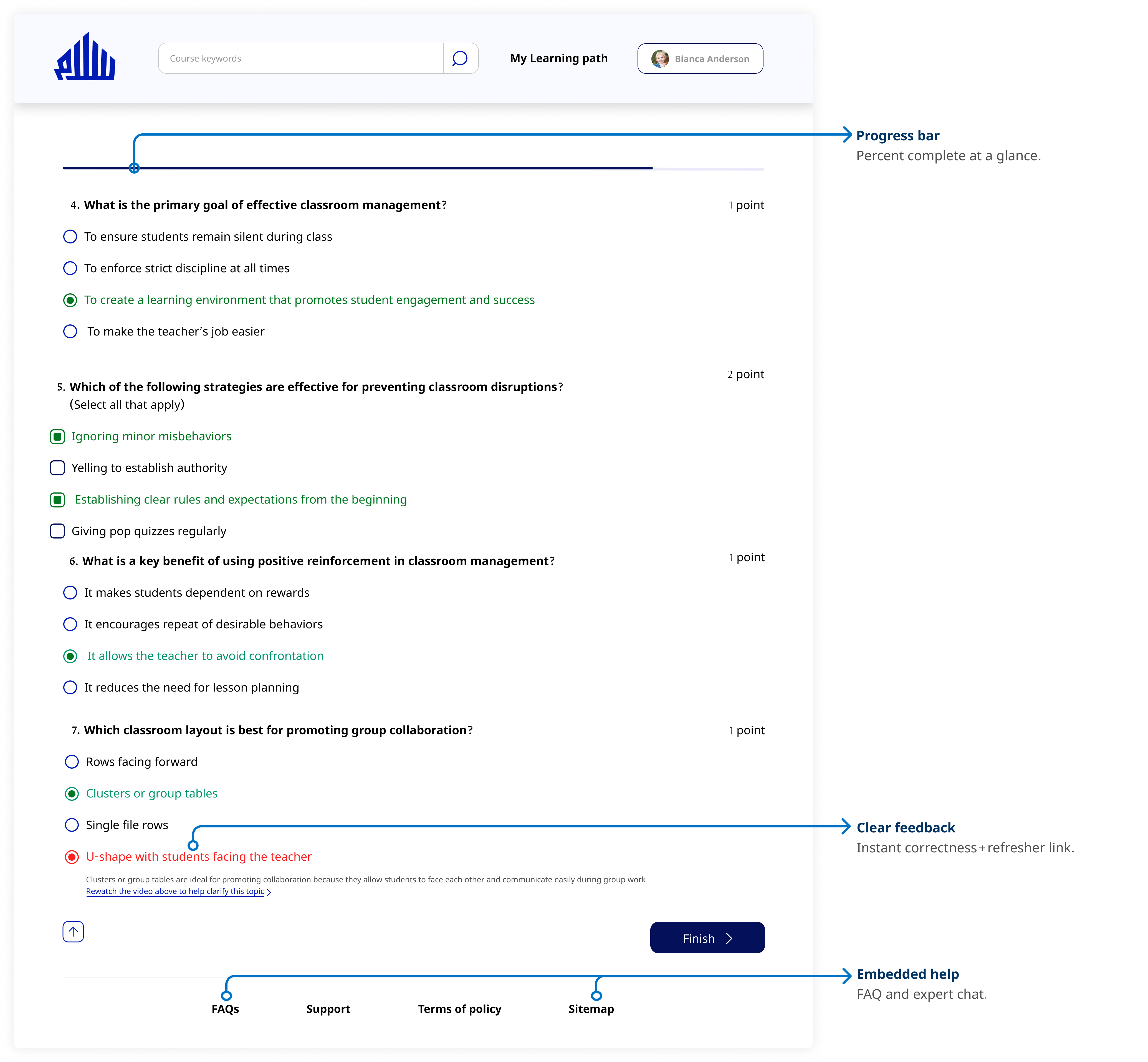
I used insights from usability testing and design critiques to refine the final design, then evaluated it with surveys and Maze:
• 94% felt more confident navigating their learning path.
• 97% completed core tasks (vs. 65% before).
• Misclick rate dropped to 6%.
This project reinforced three lessons I carry forward:
• Designing for teachers means designing for motivation, not only for tasks.
• Even small UI changes shaped how naturally teachers could trust and engage with the system.
• Giving users control over their learning path builds motivation and confidence.
Thank you for taking the time to review my work! If you’d like to see more, here are my other projects.


.jpg)